OVERVIEW
Assignment
After Hormel’s purchase of Saag’s, to redesign and re-brand the Saag’s website—including the art direction of its photography and packaging—in order to better communicate its bistro heritage and high-end products.
SOLUTION
Selecting a new set of typefaces, colors, voice, and imagery to completely reimagine Saag’s digital brand presence while launching a new website that emphasized narrative and engaged audiences to participate.
HORMEL/SAAGS
UX/UI
Art Direction
Visual Design
Branding
Art Director / Lead Designer
2015
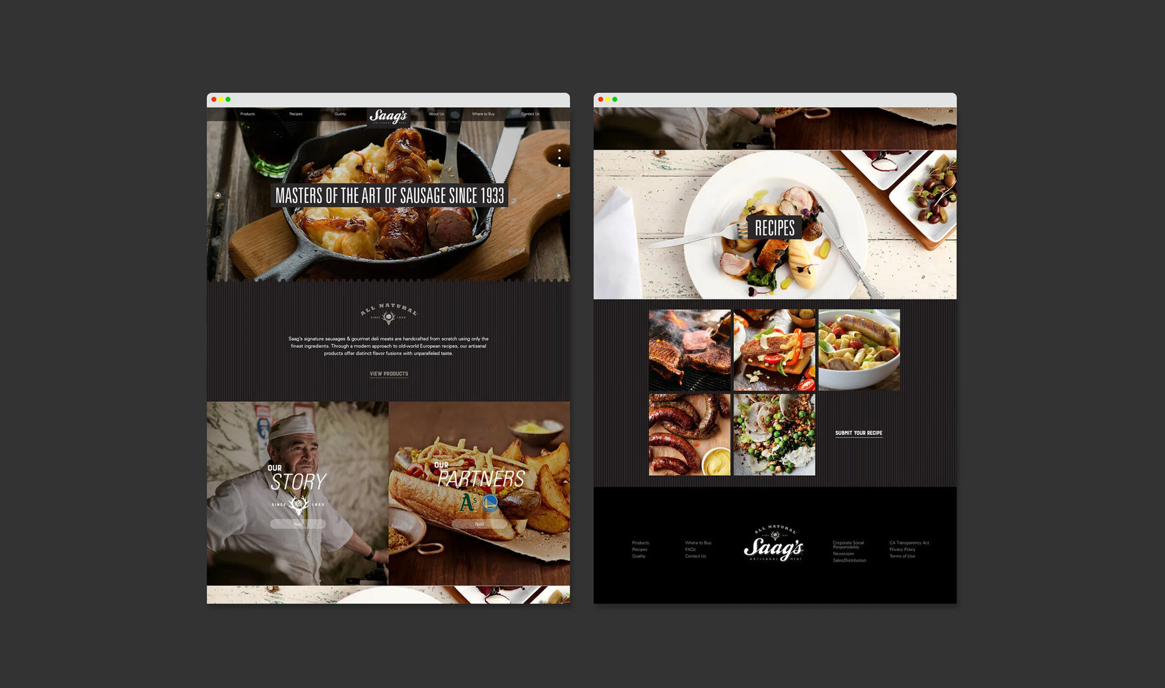
Home Page (Desktop)
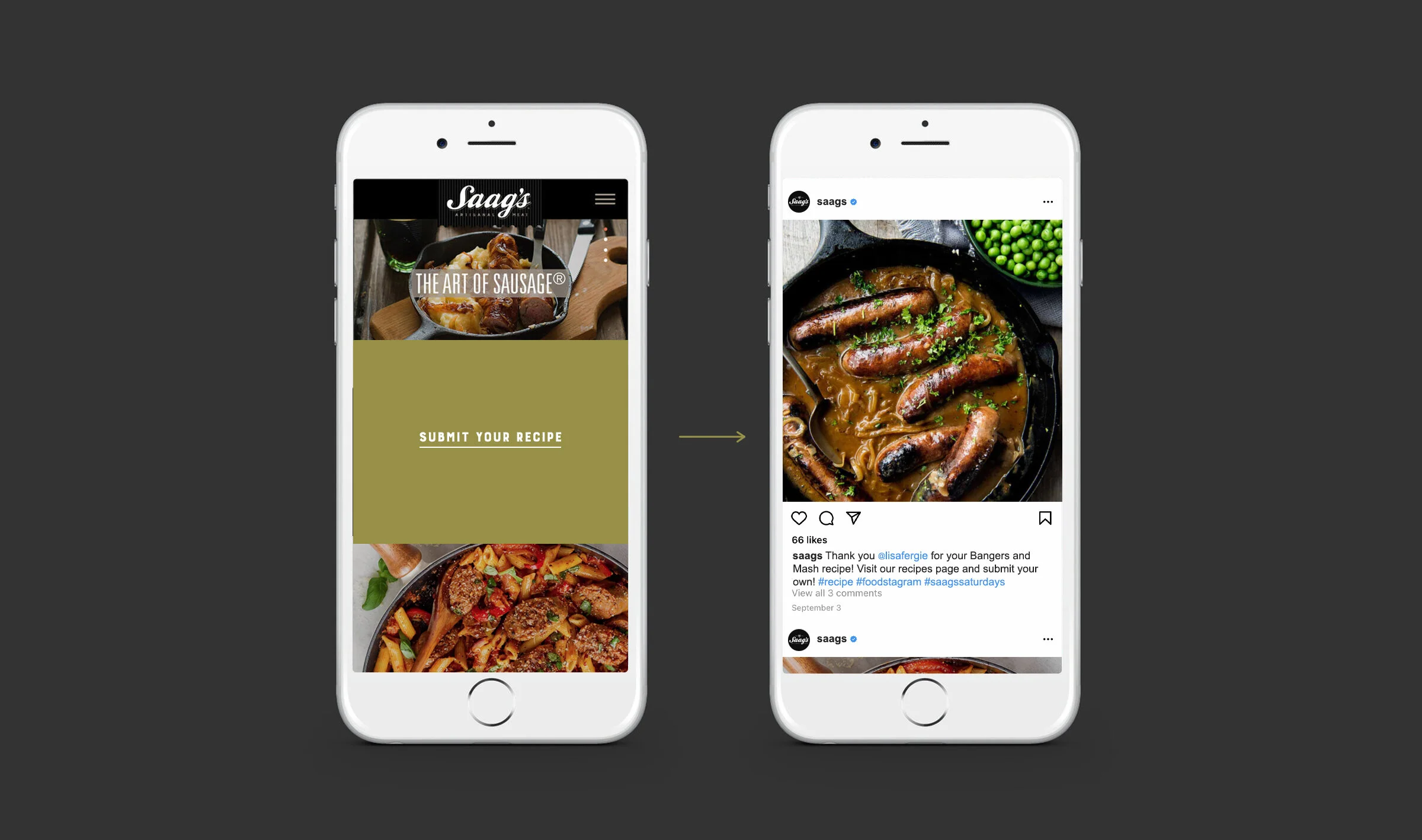
Mobile Layouts
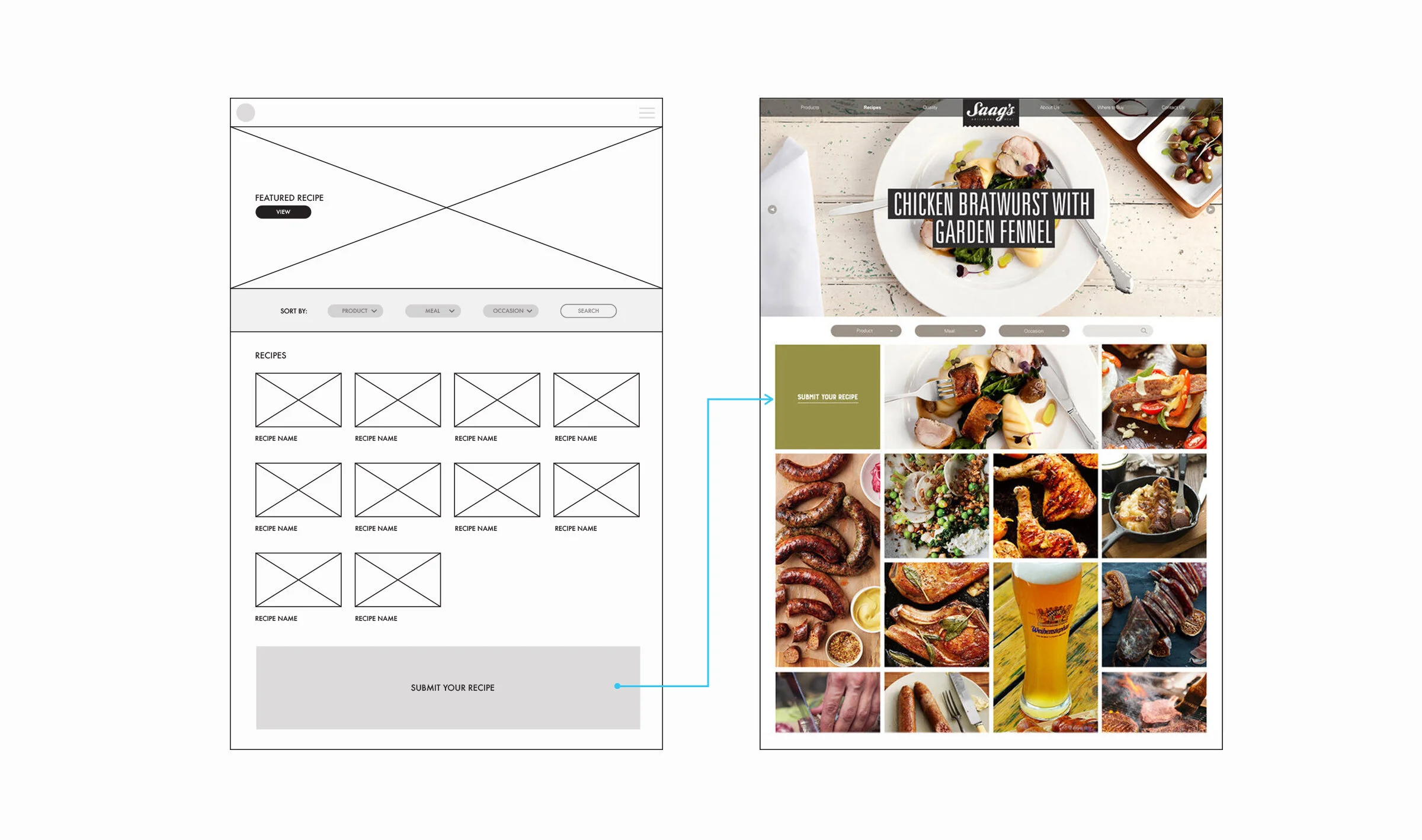
Recipes Main Page: wireframes and visual translation for a more image-centric page that would hide the minimal amount of recipes at launch and emphasize user recipe-submissions.
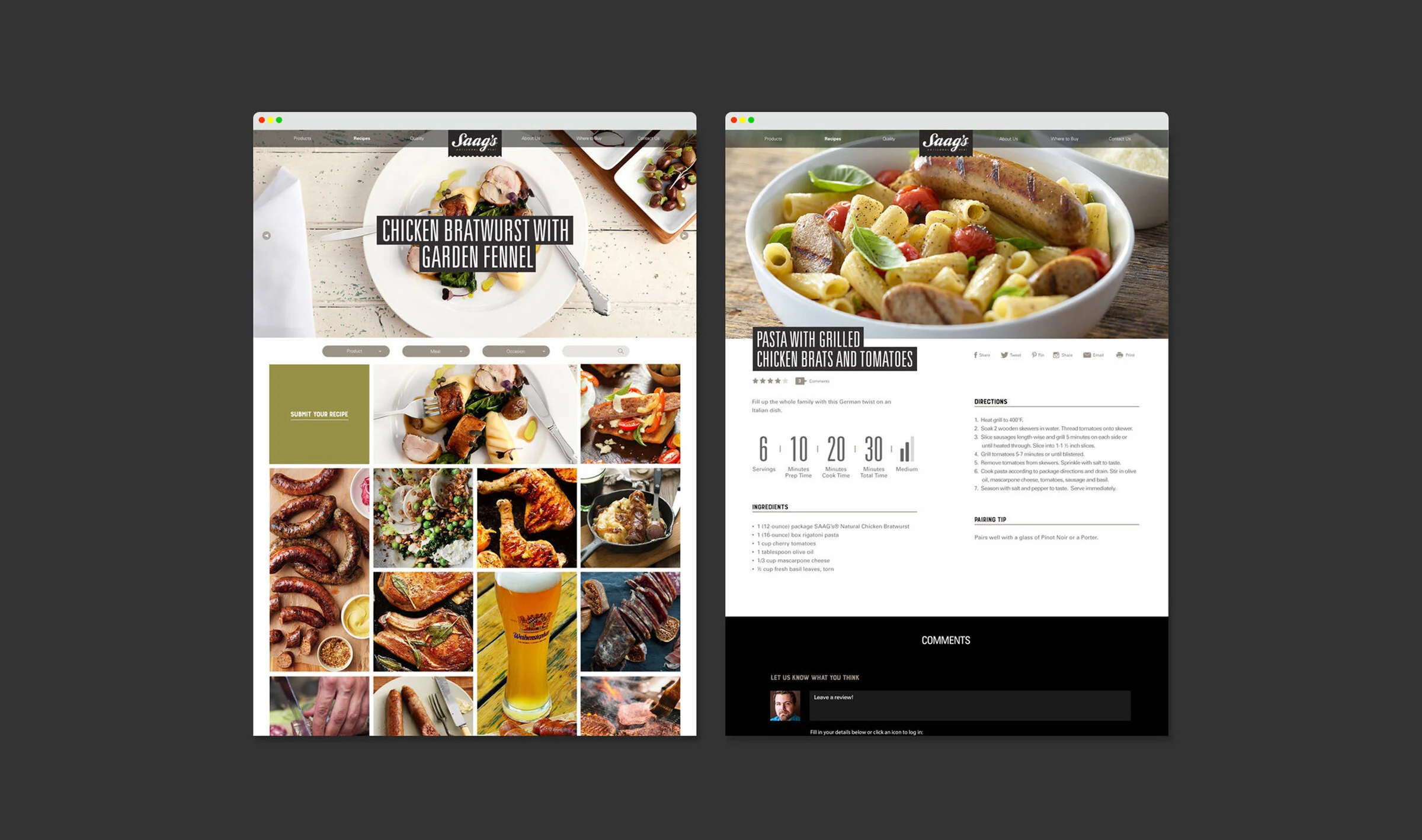
Individual Recipe Page: considering the use-case of recipe readers, sections with varying lengths required rethinking architecture into a two-column layout, reducing scrolling and maximizing visibility on screen.
Final Recipes Main Page and Recipes Individual Page
UGC recipes: web concepts helped inform social media mini-campaigns
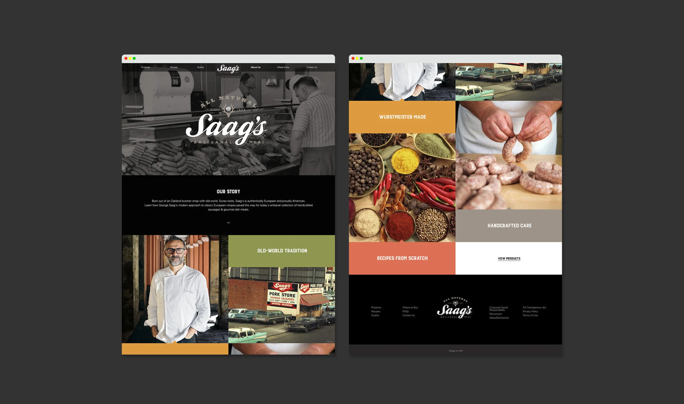
The story behind Saag’s was highlighted in order to communicate the brand’s bistro history and high-end market positioning.
The design language created for the website also informed a whole new look for Saag’s packaging for which much critical acclaim was received in some obscure corners of the design blogosphere.

